On paper, Samsung’s Galaxy S21 flagship is a downgrade in several ways compared to last year’s S20. There’s less RAM, a lower resolution display, a plastic back and no curved edge on the screen (if you even consider that a downgrade). Despite the ‘downgrades,’ the Galaxy S21 is a fantastic smartphone and sets the bar for every Android flagship launching this year.
Not everyone will agree, but when you consider what Samsung dropped from the S21 hardware — and what the phone gained — it mostly balances out. Unfortunately, the software situation does leave me wanting, especially when it comes to the camera.
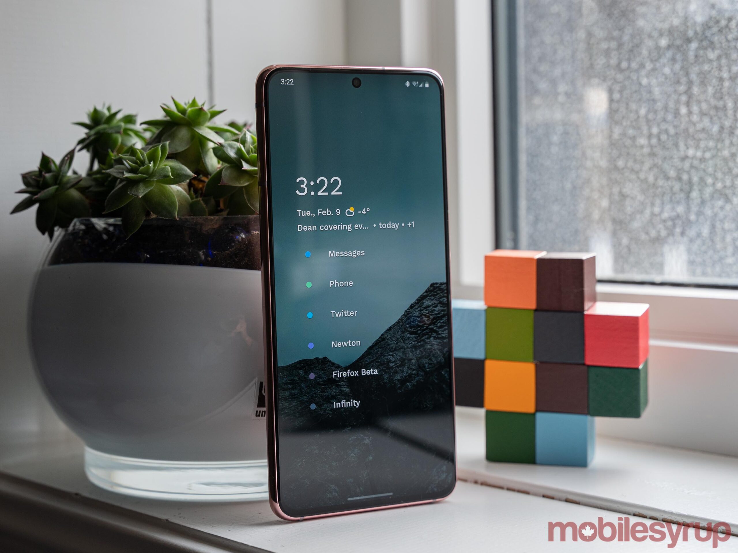
It’s also worth noting that this review’s focus is the Galaxy S21, which is the lowest of the three 2021 Samsung flagships. The S21+ is basically the same as the S21 aside from size and battery, while the S21 Ultra boasts better camera hardware and other benefits.
What’s particularly interesting about Samsung’s 2021 line-up is that picking the S21 doesn’t mean missing out on anything. Aside from some extra battery and a larger display, the S21+ doesn’t offer any notable additional features. The choice between these two phones purely comes down to your screen size preference. In my case, I prefer a smaller display, and the S21 felt great in my hands, if a tad tall. When deciding between the S21 Ultra and the S21, there are more things to consider.
For most people, I think the Ultra offers significantly more than what’s necessary. If you’re after a decent Samsung flagship at a reasonable price, look no further than the S21.
Specs
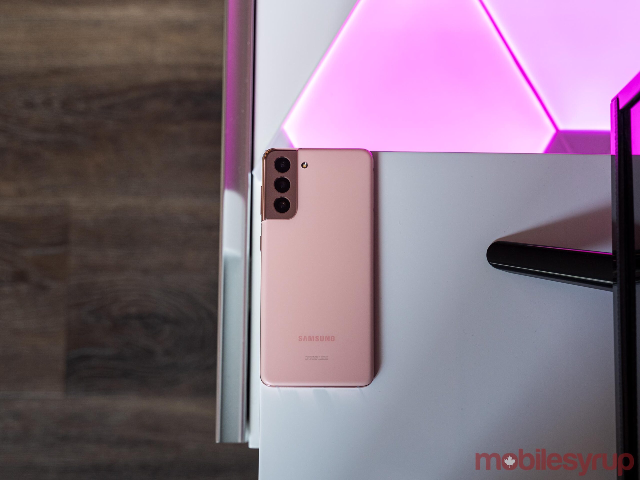
The best looking Samsung flagship in years
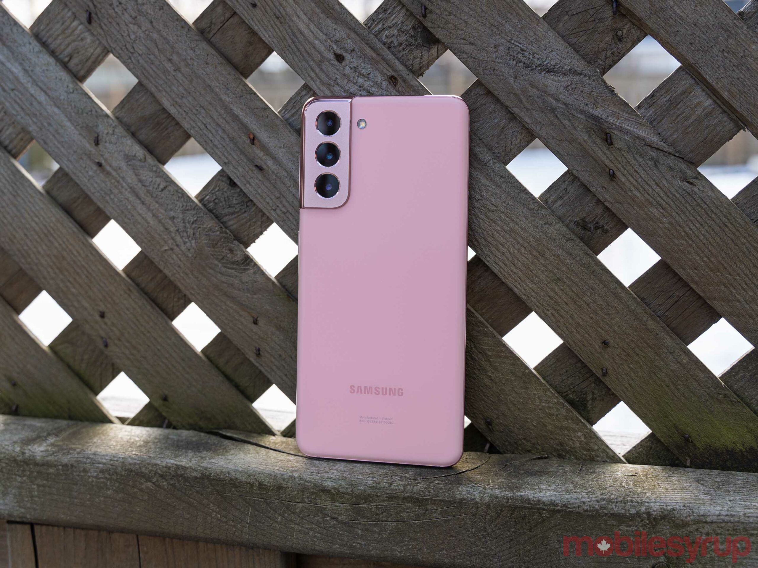
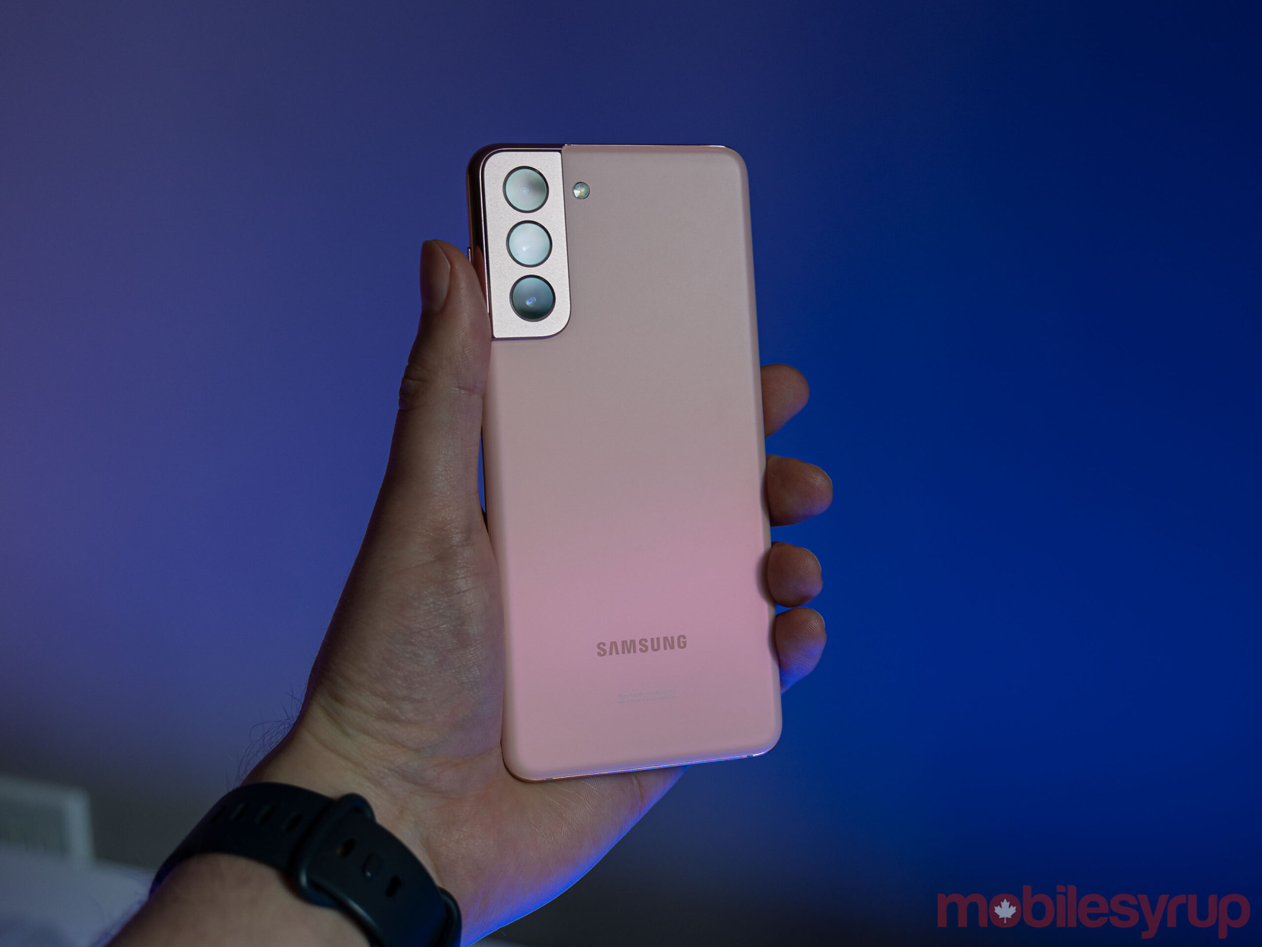
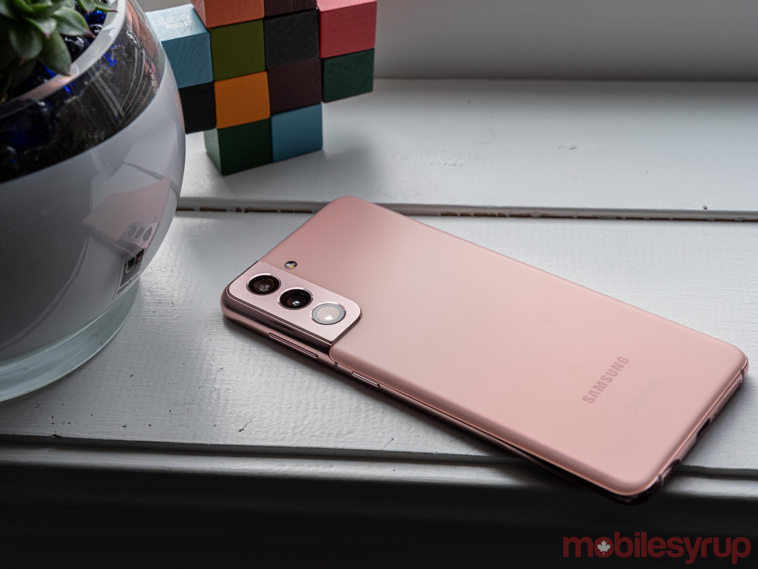
Samsung managed to pull off one of its best smartphone designs in years with the S21. I received a ‘Phantom Pink’ unit from the company to review, and the colour is stunning. I particularly like how the metal border around the edge of the phone makes everything pop. Thanks to the flat display, the metal edge stands out, contrasting with the screen. There’s a slight hint of curve right where the glass meets the metal that helps the whole thing feel smooth and unified.
As for the camera bump, the controversial design works in person. Unlike past Galaxy S devices and other flagships, the bump feels more natural since it comes up as part of the metal band around the phone. The bump is also unique — I hope Samsung sticks with the design for at least a few years since it’s so unlike other options on the market.
And for those worried about the plastic back, it’s fine. There’s no flex or plasticky feel to it — the matte coating actually makes it feel quite premium and even helps with fingerprints, although I couldn’t keep the phone entirely smudge-free. And the best part? One less super-fragile part of the phone to break if it takes a tumble.
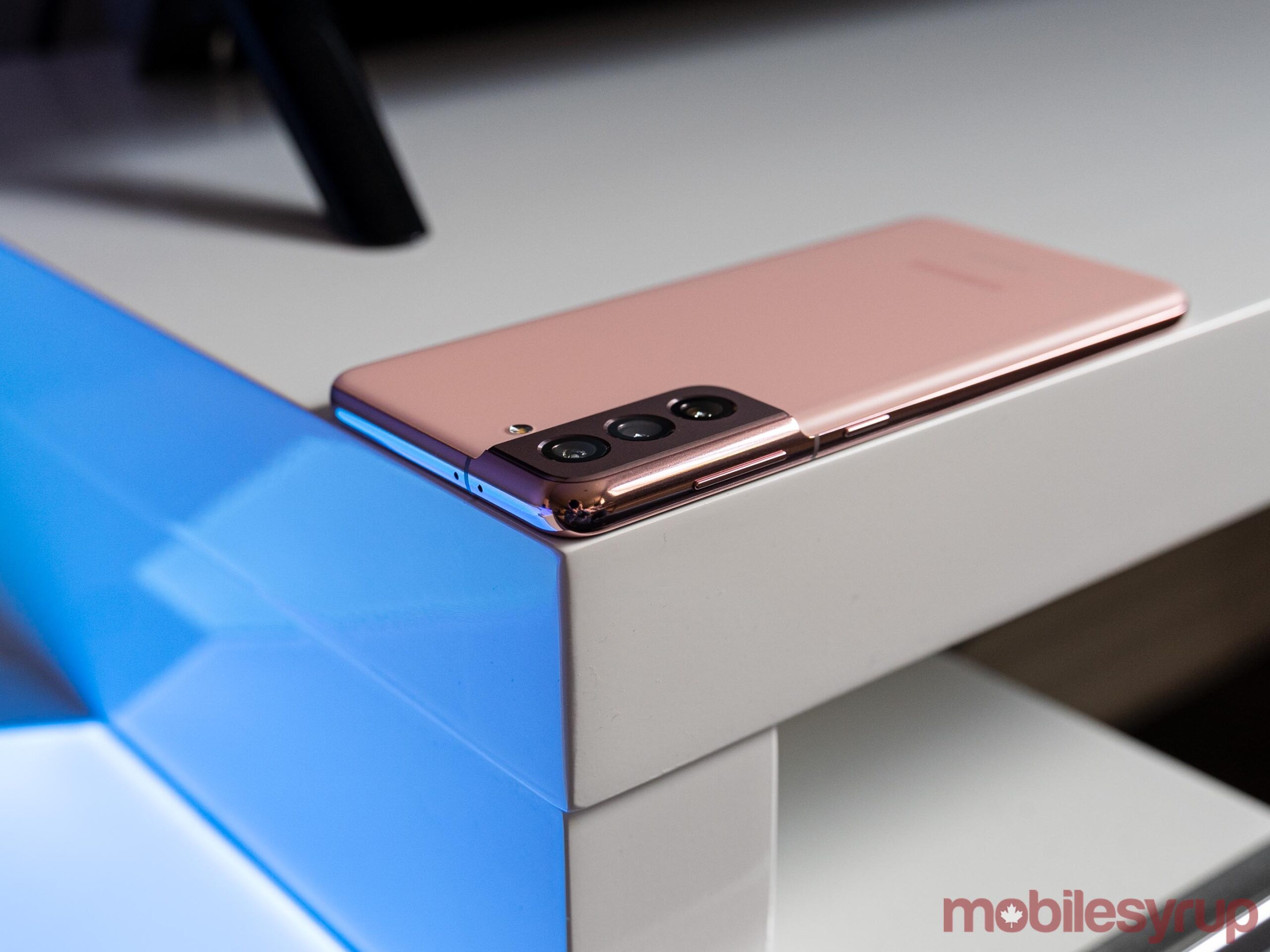
My only real complaint with the design relates to the power button. Most phones I use that place both the power and volume buttons on the same side of the device keep the volume rocker below the power button. The S21 reverses that standard, putting the volume button above the power. My thumb naturally lands on the volume rocker and I found myself repeatedly hitting the volume instead of the power button.
Eventually, I got used to the placement, but I think Samsung could have improved the buttons in a few ways. Aside from a better button arrangement, making the power button a contrasting colour (like the Google Pixel) or a different texture would help set the buttons apart.
Peep these pixels
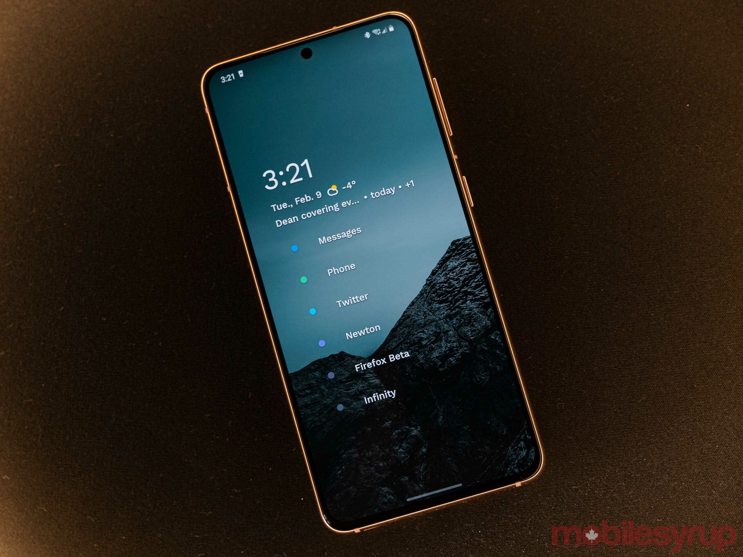
The resolution ‘downgrade’ with the S21 is perhaps one of the most ridiculous complaints I’ve ever heard in relation to a smartphone. Sure, on paper, the S21 has fewer pixels per inch (PPI) than last year’s S20 (S21’s 1080 x 2400 pixel resolution, or 421 PPI to the S20’s 1,440 x 3,200 pixels, or 563 PPI). Despite that decrease, practically no one will notice the difference.
At the screen size we’re working with, it’s pretty hard to tell the difference between display resolutions above a certain point. Some would put that number around 400 PPI. Regardless, only the most extreme pixel peepers will notice a difference using the S20 and S21 side by side. For some perspective, nearly every other comparable flagship has a similar PPI. The Pixel 5 comes in at 432 PPI, the iPhone 12 Pro at around 460 PPI and the Huawei P40 Pro around 441 PPI.
With that in mind, the bigger Galaxy S21+ might be problematic for some. It falls slightly below the magic number with 394 PPI. MobileSyrup senior staff reporter Dean Daley noted in his review of the S21+ that it looks noticeably less sharp compared to the S20+.
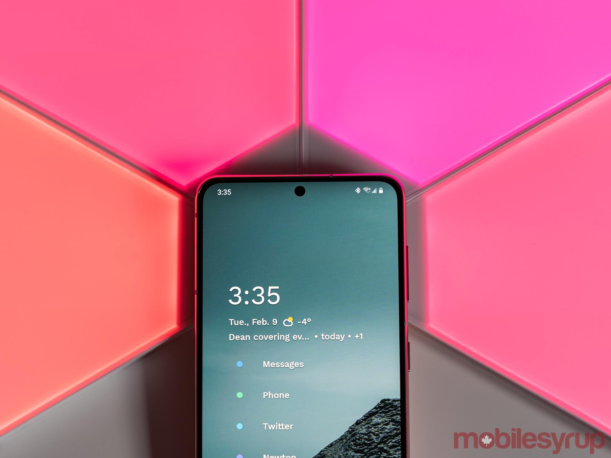
Perhaps the most annoying part about the focus on the resolution is it distracts from the other excellent aspects of the S21 display. It’s honestly one of the best AMOLED panels I’ve used. It’s super sharp, the colours are vibrant (Samsung’s typical oversaturation is alive and well here). If you like using your phone in dark mode, this display is even better. I’ve noticed other OLED panels in smartphones can have a smearing effect when scrolling through dark mode apps with lots of images, like social media. It’s likely related to the panel having to quickly transition pixels from an off state (black) to a bright state (like white). The S21 doesn’t have the same problem.
One problem the S21 screen does have is that when using dark mode, apps using a dark grey tone instead of true black create a sort of ‘halo’ glow around the camera cut out. It’s especially noticeable at low brightness. While minor, it can be a bit annoying.
“I’m glad I don’t have to fiddle with that setting this year and can just enjoy the better display mode out of the box.”
Plus, the phone sports an excellent ‘adaptive’ refresh rate of up to 120Hz. Animations and scrolling look buttery smooth, and it makes using the phone much, much more enjoyable. The best part? Samsung doesn’t make users choose between a high refresh rate or a high resolution this year. Granted, that’s largely because there is no high-res option this year. When I reviewed the S20 last year, I set it to the low-res, high refresh rate option and found it preferable to the 60Hz high-res mode. I’m glad I don’t have to fiddle with that setting this year and can just enjoy the better display mode out of the box.
Powerful performance
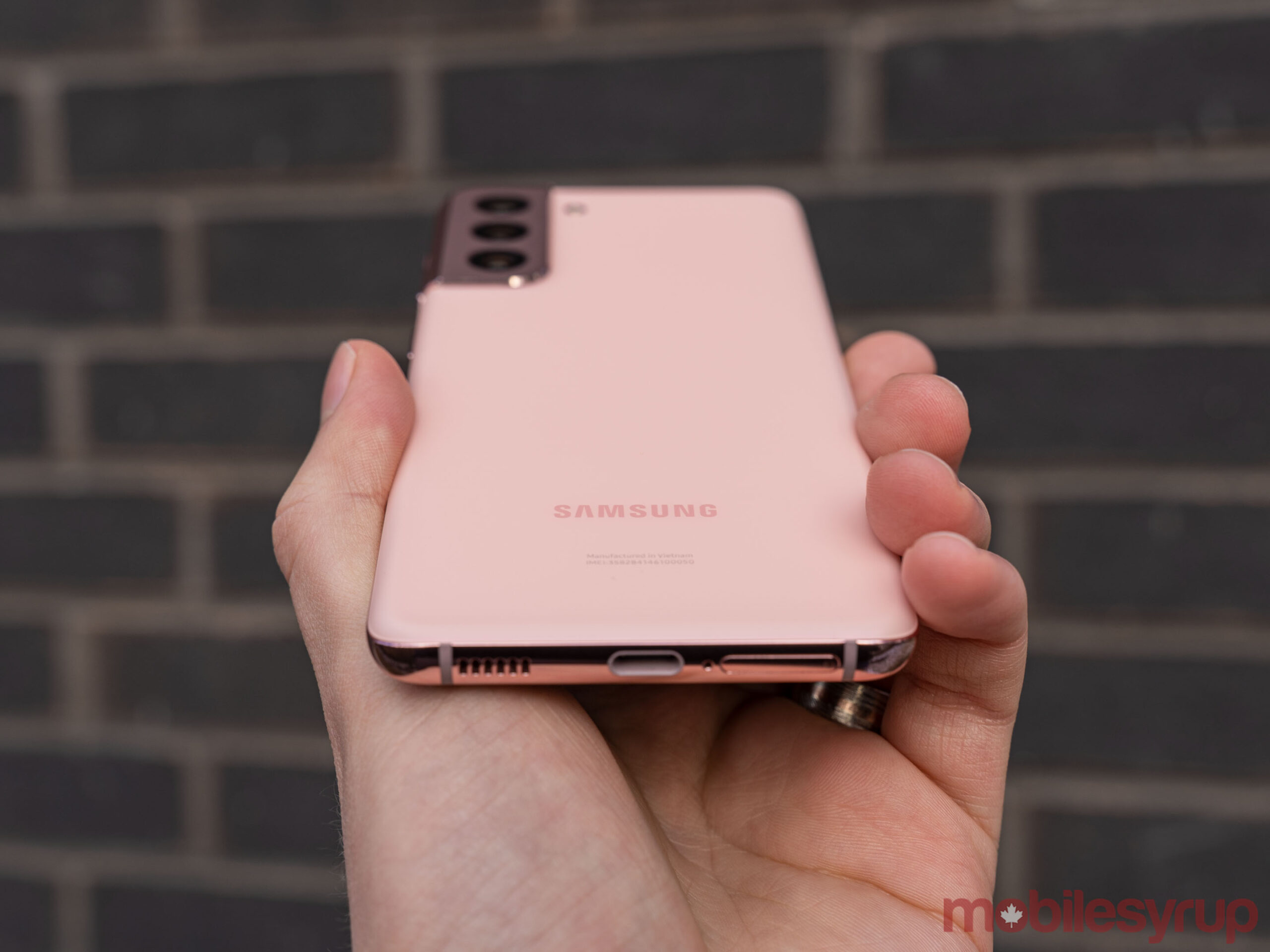
Unsurprisingly, performance on the Galaxy S21 was top-notch. The Snapdragon 888 functions well, offering smooth performance and no hiccups.
In the roughly week and a half I’ve had with the S21, I’ve encountered no significant issues like app crashes or freezes. The high refresh rate display helped things feel smooth, but there’s also something to be said for the capability of the Snapdragon 888.
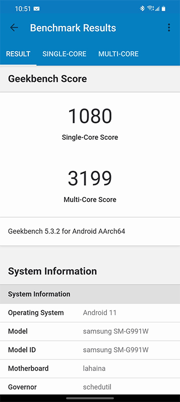
For those who care about benchmarks, I ran a Geekbench 5 test on the S21. The phone scored 1,080 for single-core and 3,199 for multi-core, a decent leap over last year’s Snapdragon 865. For comparison, the S20 Ultra scored 800 and 2,644 respectively (unfortunately, at the time of writing MobileSyrup didn’t have a regular S20 to test against).
This year’s S21 Ultra — also with a Snapdragon 888 — slightly outperformed the S21 with scores of 1,108 for single-core and 3,411 for multi-core. That could be due in part to the extra RAM, or perhaps some optimization or tuning on Samsung’s end. Regardless, the performance delta between the S21 and S21 Ultra likely won’t make a significant difference and shouldn’t pressure anyone to opt for the more expensive device to eke out some extra performance.
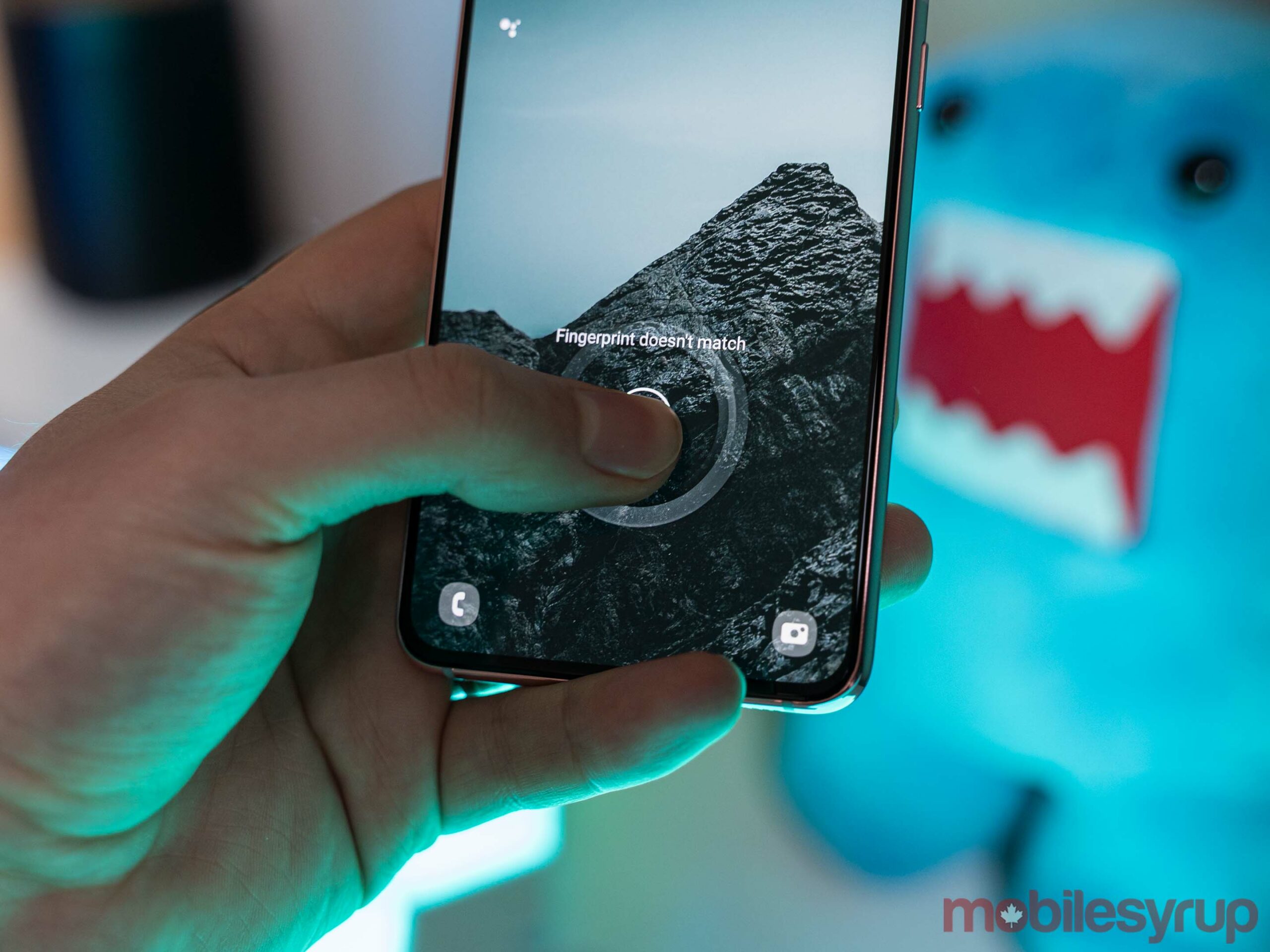
Despite not working in the picture, the S21’s in-display fingerprint scanner was quite reliable in my testing.
As for real-world performance, the majority of my usage involved social media apps like Twitter and Instagram, browsing Reddit, checking Slack, browsing the web and playing a few games. In my testing, the S21 handled all of these things perfectly fine with snappy performance. Coming from a Pixel 4a, I’d say the S21 is faster, but the few seconds you might save opening an app honestly doesn’t make a huge difference in daily use.
Gamers will likely appreciate the extra power more. I tried a few different titles, and, with the exception of one game that seemed locked to 30fps, performance was incredibly smooth across the board. Levels loaded quickly, animations were smooth, and even after playing for upwards of 30 minutes, the S21 never got noticeably warm.
Not the battery champ I’d hoped for
Battery life on the Galaxy S21 is fair, but nothing to get excited about. Much like last year’s S20, the S21 easily makes it through a day with some juice left in the tank, but it’s usually not enough to get through a second day.
With my typical usage, I’d end my day at around 30 or 40 percent and about four hours of screen on time. While that was enough to leave the phone off the charger overnight, it usually just meant throwing it on charge shortly after getting up in the morning.
I’d hoped to see better battery life on the S21, but what Samsung delivered will be fine for most people.
It’s worth noting that I haven’t been commuting (or leaving my house at all, really) because of the pandemic. As such, I was connected to Wi-Fi for most of my time with the S21. If you spend a lot of time connected to mobile networks instead, it may reduce your battery life, especially if those networks are 5G.
One other note to make about battery: Samsung’s One UI includes a feature that ‘sleeps’ apps you don’t use often. While this can help with battery life, it also seemed to mess with apps like Fitbit that worked with connected wearables. With a bunch of fiddling, I was able to get things working properly, but if you’ve got a wearable, be ready for One UI to cause problems.
One UI is overwhelming and full of ads
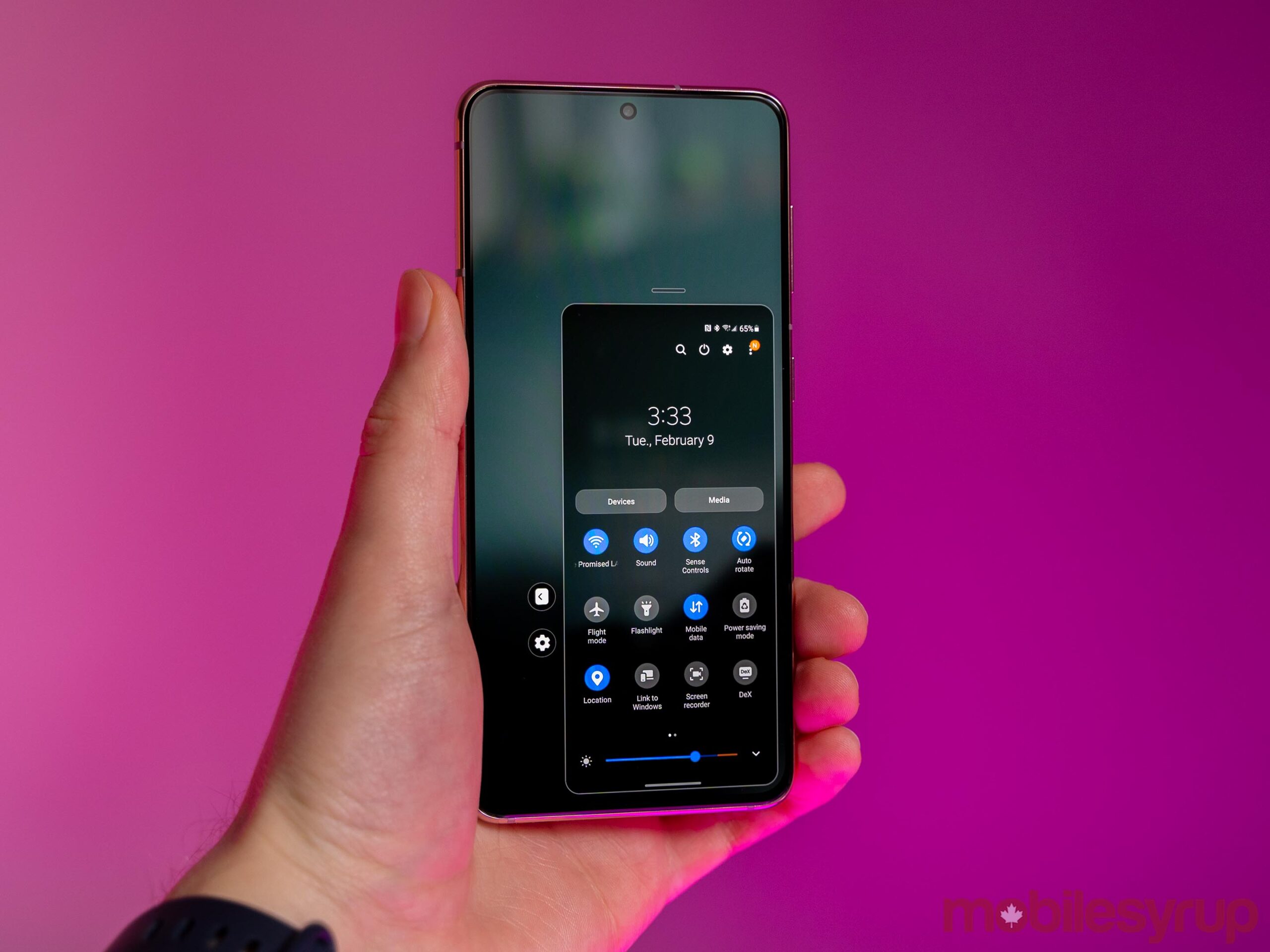
Speaking of One UI, Samsung managed to make one of the better Android interfaces available and then mess it up. One UI has a unique look and, with this latest iteration, Samsung has refined the interface. It feels really smooth, looks great and is usually fun to use.
However, there are still a few major gripes I have with it. Some carry over from last year, while others are new for me.
First and foremost, Samsung has placed ads throughout One UI. Yes, you can turn them off, but that’s beside the point. No one should have to dig through settings menus to turn off ads on their $1,000+ smartphone. What’s even more frustrating is the ads often disrupt apps in the worst way.
Ads aside, Samsung did slim down some of the options this time around, but overall I still found using One UI to be overwhelming. Considering I know my way around most phones, I can’t imagine how someone who isn’t super into tech would feel using a One UI device. For example, after setting up the device I was bombarded with permission pop-ups asking for access to different information on my phone. Half the time, I had no idea which apps were even asking — every piece of Samsung software seemed to demand access at once, instead of waiting for me to interact with it.
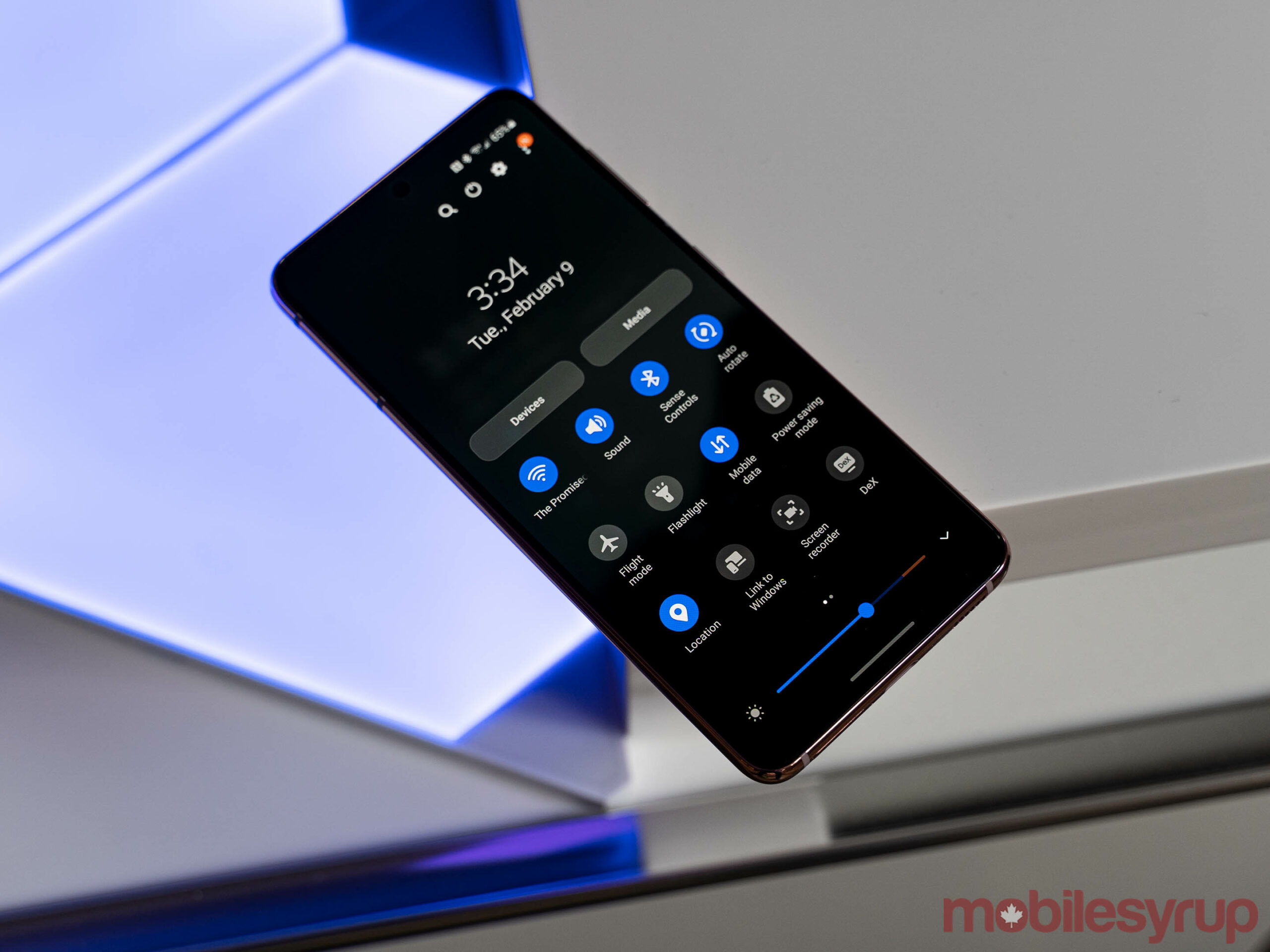
Likewise, I had to spend some time switching away from Samsung’s various apps and services. In some cases, this was because I’m well set up in another ecosystem — Google Calendar is a fine example of this. In other cases, it’s simply because Samsung’s offering isn’t good. The default Samsung keyboard, for example, is a pain to use.
Doubly confusing for many people will be the choice of texting app. This year, the S21 comes with both Google Messages and Samsung Messages out of the box. While I appreciated not needing to download Google Messages myself, Samsung doesn’t do a good job explaining the difference between the two and why people should pick one over the other. If you’re wondering, pick Google Messages — the only benefit to Samsung Messages is it sports a similar look to the rest of One UI. Beyond that, Google Messages is functionally better in every way.
Ultimately, the software situation on Samsung phones is still getting better, but it can also use some improvement. One UI remains one of my favourite Android interfaces for its aesthetics, but it isn’t as clean or accessible as Google’s Pixel interface.
Camera software needs some work
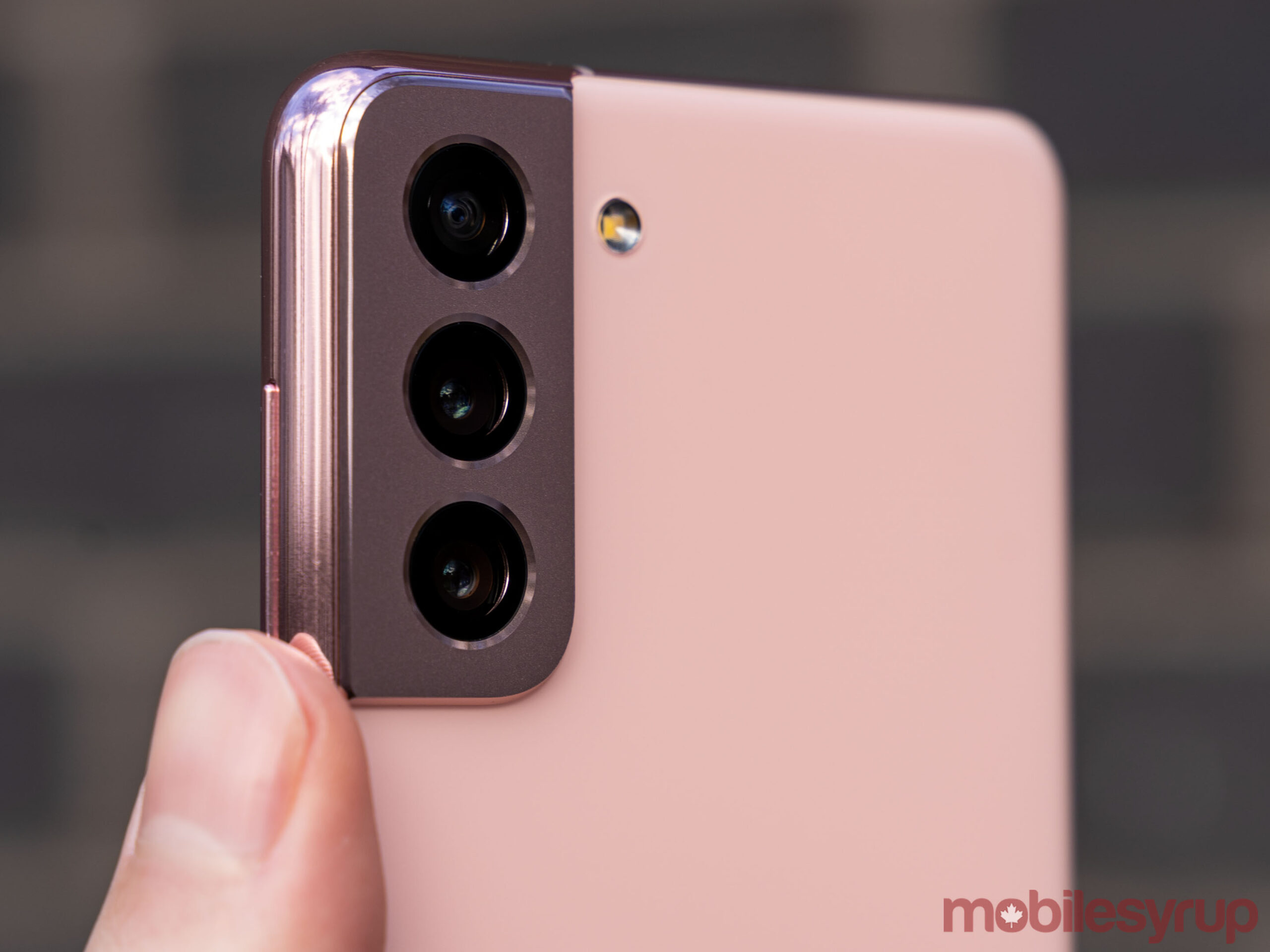
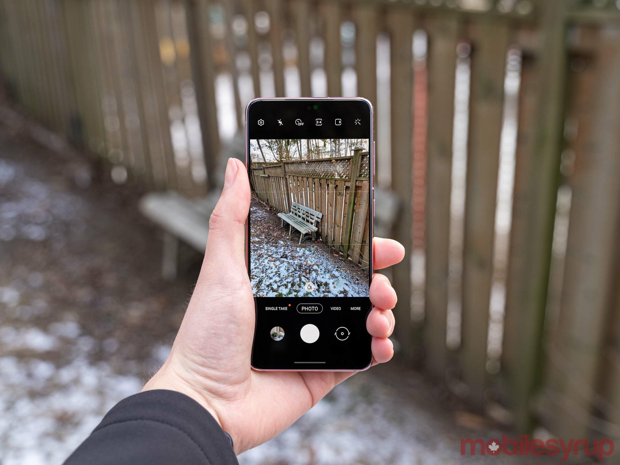
Once again, Samsung put some top-notch camera hardware into its flagship and shipped it with a middling software experience. Some of it comes down to preference — I definitely prefer the more ‘realistic’ colours you’d get from a Pixel or iPhone camera to what Samsung does with its photos — but there’s plenty of processing going on that just makes images worse.
Before I get into the test shots, I want to point out that in almost every photo, I left the settings on default. Most people don’t mess around with camera settings or even tap-to-focus. Unless I was testing a specific feature, every photo I took used the default set up and I didn’t tap to focus — just pointed the camera and clicked the button.
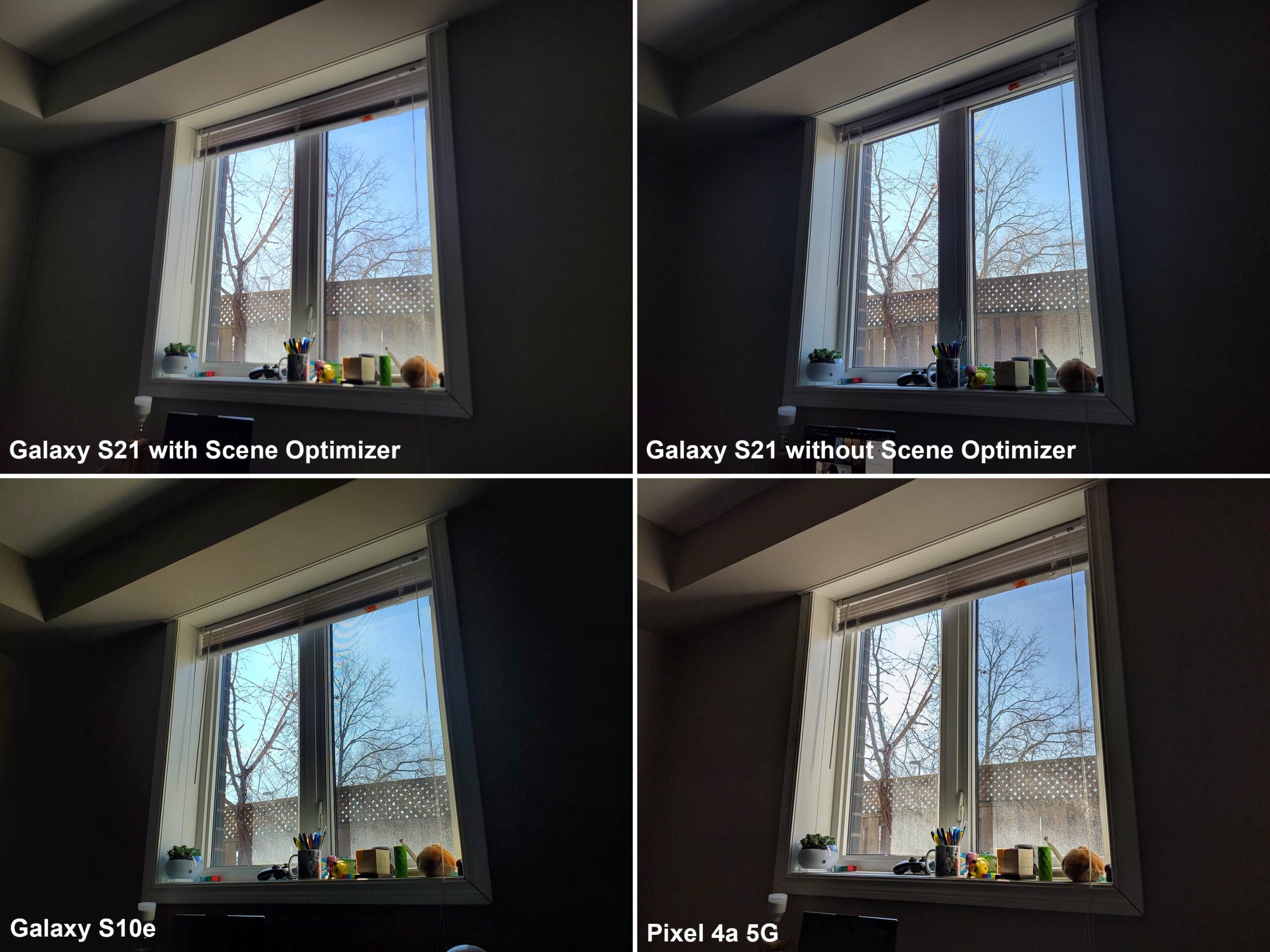
The S21 with scene optimizer muddied the objects on the window sill, but performed better without the scene optimizer.
One test involved snapping a picture of a window from a dark room. Most cameras should struggle with this type of image that incorporates both a bright and dark section. However, the S21 really disappointed here compared to both a Pixel 4a 5G and even an S10e that I had laying around. The S21 brightened the shadows, which was fine, but smoothed most of the detail out of items sitting on the window sill. The S21 managed the sky better, keeping it more blue than the Pixel did. Further, the S21 has less noise in the shadows, which I’d attribute to the bigger sensor pulling in more light than the Pixel. Overall, the S21 image is less sharp and it even removed the lines caused by the screen in the window.
Disabling the scene optimizer helped improve the shot, and shooting in 64-megapixel high-res mode also improved the detail, but every photo I took with the S21 featured a bluish halo around the window that wasn’t present in other images. In other instances (as you’ll see in the gallery below), scene optimizer can totally change the colour of an image for no apparent reason.
Scene optimizer didn’t always mess up the image. Other pictures I took with it on came out fine. For example, the one I took of the stuffed Domos did a decent job preserving the detail in the fuzz, plus it made the colours pop more than the Pixel 4a 5G did. Ultimately, Samsung’s scene optimizer was pretty hit or miss. I found I preferred photos taken without it, but there were some scenarios where it helped.
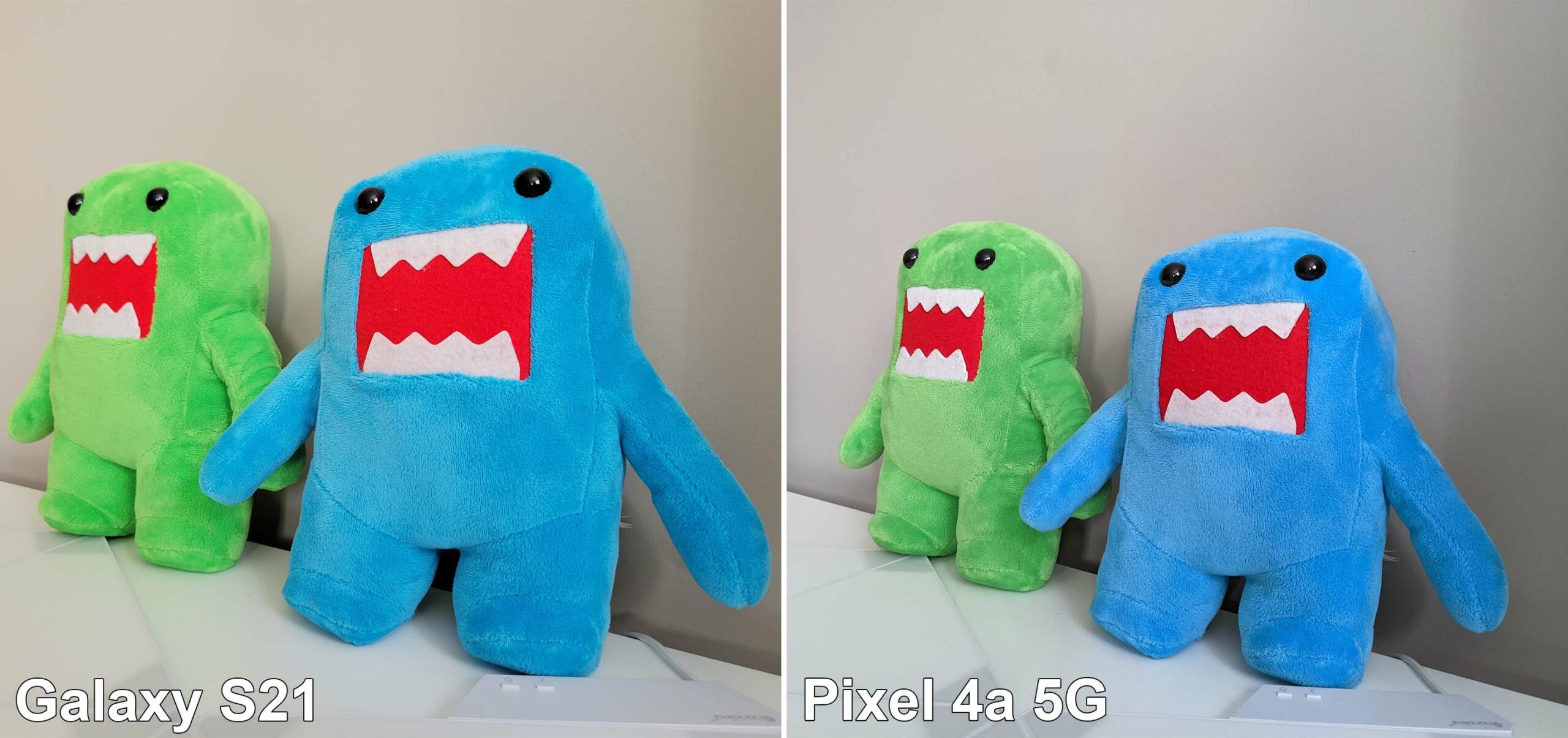
The Galaxy S21 with scene optimizer kept the detail in this image and made colours pop more than the Pixel 4a 5G.
When it comes to zoom, you’re probably safe using the 3x zoom camera, but in my experience, pushing much beyond that yielded poor results. While this could be partially thanks to the scene optimizer, pretty much any shot I took above the 3x zoom level didn’t turn out great. It’s also worth noting that the 3x zoom option is a ‘hybrid’ zoom that uses the phone’s 1.1x optical zoom and some digital zoom to get 3x total zoom.

With zoom, the text is still legible at the 3x hybrid option. At 10x, it’s harder to make out.
As for the S21 ultrawide angle lens, it snapped some decent shots. Unfortunately, I seldom find ultrawide lenses useful. I rarely need them, but I appreciate having them when I do. Again, I’d avoid the scene optimizer if possible for the best results.
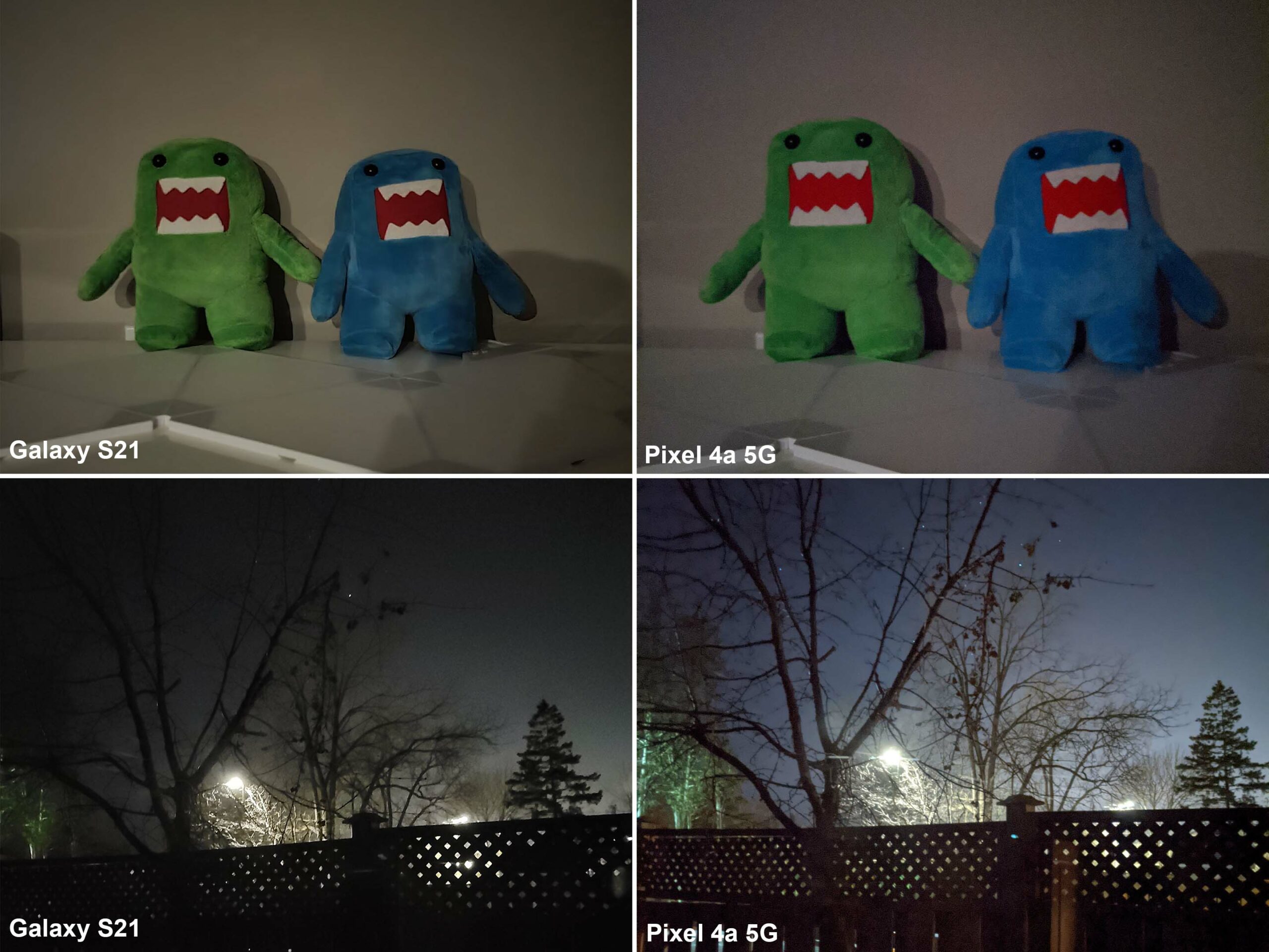
In the top test, the S21 night mode beats the Pixel 4a 5G with more detail in the Domos and a brighter image. In the bottom test, both phones messed up, but the S21 image is much worse.
When it comes to night mode, the S21 camera was again unreliable.
Sometimes it bested the Pixel 4a 5G, like in the shot with the Domos, but in another shot of my backyard the S21 didn’t fare well at all (for that matter, the Pixel 4a 5G also butchered this shot, but it came out better than the S21).

The S21 keeps more detail in selfies, but loses some with skin smoothing (even when the feature is disabled).
However, the S21 surprised me with its selfie chops. Primarily, I think this comes down to the 10-megapixel sensor, which is quite a bit bigger and captures more detail. In typical Samsung fashion, the software then smooths out all the detail it captures. Even when fully disabled, there’s still a disappointing amount of smoothing going on. I found the smoothing was less evident if there was plenty of light, such as outdoor selfies, but indoor pictures with less lighting made the smoothing more obvious.
The S21 is a solid flagship, but likely isn’t worth the upgrade
Depending on what you’re looking for in a smartphone, the Samsung Galaxy S21 will range from must-buy to not worth the money. For me, the S21 hardware consistently impressed and worked well for my typical day-to-day activities. Overall, using it was an excellent experience.
At the same time, the camera was mostly disappointing. While I think some people will really appreciate the camera and the improvements Samsung made, I found it unreliable. More than anything else, I seek consistency in phone cameras because I’d rather not worry about whether I get the shot. I’d prefer to point, shoot and put the phone away. In my experience, the S21 required too much fiddling.
That said, my issues with Samsung’s camera primarily stem from software. The company could improve its image processing with an update in the future, but don’t buy a phone for the promise of a future fix.
Also disappointing was the software, which is more frustrating this time around. I think Samsung is really close to nailing the software experience, but the company keeps missing the mark. That makes all the shortcomings so much worse.
Who’s the S21 for?
If you’re a fan of Samsung devices and you’re upgrading from an older phone, such as an S10 series, you’ll likely enjoy a lot of what the S21 offers. If you’re rocking an S20, there’s very little here that’s different (and the few hardware pieces Samsung did change arguably make the S21 a downgrade for you).
As for Pixel users, I don’t think there’s much the S21 will do that you’ll prefer to what you get with your current phone, except offer a much nicer display. Finally, for the iPhone users out there, I’d say the S21 isn’t the best way to make the switch to the Android ecosystem.
The Samsung Galaxy S21 starts at $1,129.99 in Canada. You can also read our full reviews of the Galaxy S21+ and the S21 Ultra.
“If you’re a fan of Samsung devices and upgrading from an older phone, you’ll likely enjoy a lot of what the S21 offers”
8.5

