It looks like Google has started widely rolling out a new rounded search bar interface in Maps on Android following a test on iOS.
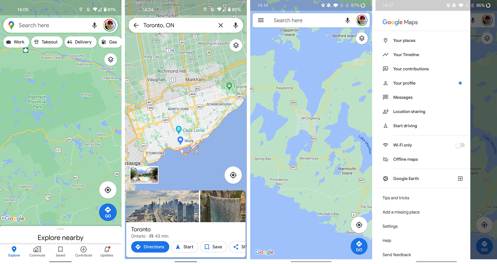
Google has been updating and adjusting parts of Maps for a while now. The latest update changes the search bar from a rectangle with slightly rounded corners to a capsule shape with rounded ends. It fits in better with other recent changes, such as the capsule-shaped buttons for things like ‘Takeout,’ and ‘Gas’ that reside below the search bar.

Left two screens: New Google Maps. Right screens: Old Maps
Along with changing the shape of the search bar, Google also ditched the three-line ‘hamburger’ menu button that resided in the left corner of the bar (the Google account button remains on the right side of the bar). Tapping the menu button used to give access to ‘Your places,’ ‘Your timeline,’ ‘Your contributions,’ ‘Your profile,’ ‘Messages’ (I didn’t even know Maps had a chat feature, but I’m not surprised), ‘Location sharing’ and more.
To access some of those items, like the timeline and location sharing features, users will need to click their profile icon on the right side of the search bar. Other items, like contributions and messages, can be accessed from the new buttons in the bottom navigation bar of Maps.
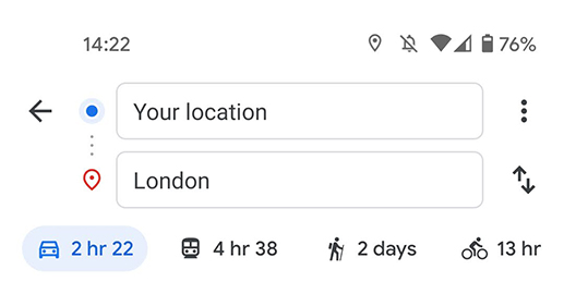
Although the rounded search bar fits in with most of the Maps interface, there are some areas where the design hasn’t carried over. Most notably, this includes the directions screen, which still uses the old rectangle-with-rounded-corners look for the search bars. I expect Google will probably remedy that soon.

Overall, it’s not a huge update to Maps, but it will change up some functionality with the removal of the hamburger menu. For the most part though, I don’t think too many people will miss it. As 9to5Google points out, Google tested the rounded search bar on iOS first before a limited test on Android. It now appears to be rolling out widely, so it should show up on your phone in the coming days if it hasn’t already.
Source: 9to5Google

