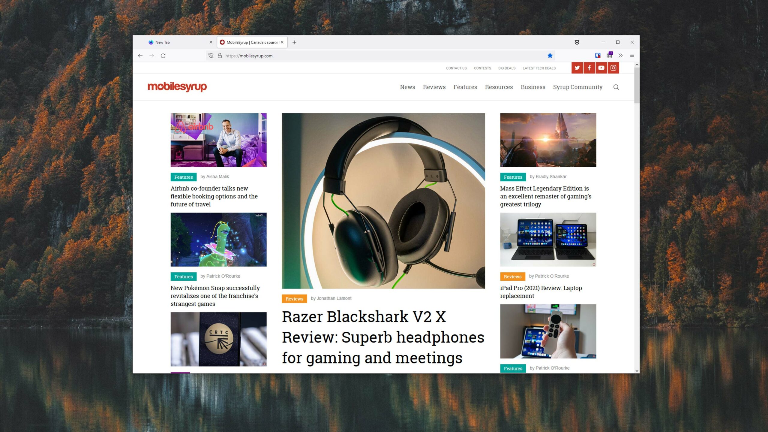
Although the biggest changes will hit Firefox on desktop, both the iOS and Android versions will get visual tweaks and new icons

On June 1st, Mozilla will roll out a whole new look for its Firefox browser. Dubbed ‘Proton,’ the new look has been in testing for a while now — I’ve been running Firefox Nightly for the last few months to follow the development — but in June, things will start looking different for everyone.
Mozilla has shared a couple of videos about the upcoming changes. One cycles through some previous versions of Firefox, but doesn’t actually show the new design. Another gives a glimpse at some of the ideas and processes that went into the design.
Generally, the design cleans up the look of Firefox and streamlines different aspects of the user interface (UI). It also completely revamps how the tab bar looks, refreshes the menu, adds rounded corners to elements like add-ons and more.
At first glance, some of the changes may not seem like much, but as someone who has used Firefox on-and-off for years, I really appreciate the more modern look and feel of the browser’s redesign.
Some of the changes coming to Firefox with Proton are also showing up in Firefox on mobile. For the iOS version of the browser, not much has changed save for some new icons that adopt the Proton styling, a new tab strip for iPad that mimics the look of Firefox on desktop and a few other small changes that make Firefox for iOS most visually consistent with its Android and desktop counterparts.
![]()
Firefox’s new look on iOS
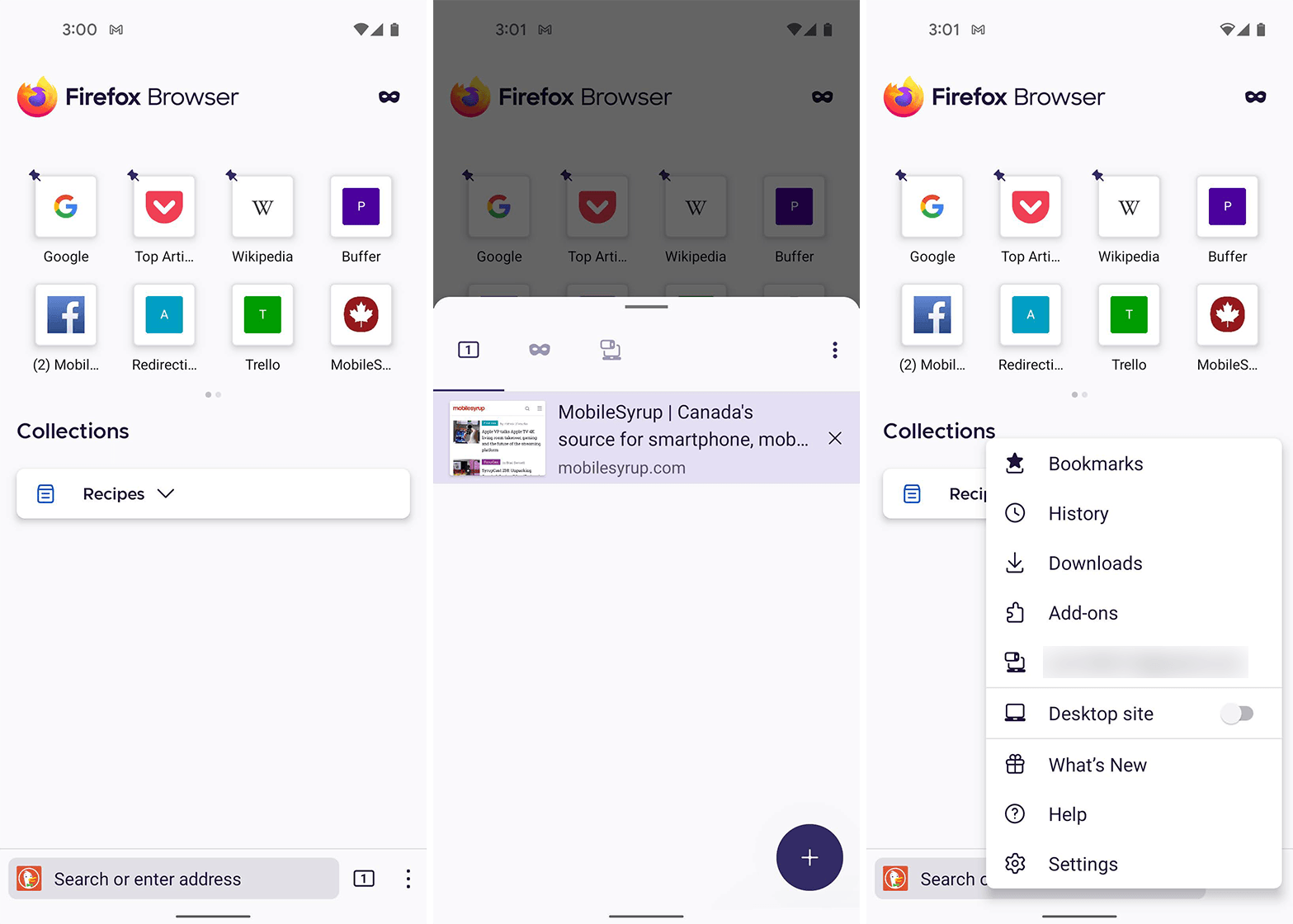
Speaking of Android, Firefox for Android recently underwent a significant overhaul both visually and under-the-hood. While some were disappointed that Mozilla scaled back extension support, Firefox for Android still supports more extensions than basically every other mobile browser. Firefox for Android is also now getting the new icons and other Proton stylings to bring it in line with Firefox on desktop.
Not everyone’s a fan
As with any major visual change, there are plenty of users who aren’t happy. The community has been very vocal about Proton in places like the r/firefox subreddit. Some of the feedback was constructive, while others simply complained that things were different. Honestly, I think Mozilla got a lot right with the new design, but it’s not perfect.
It’s also worth noting that a refreshed look likely won’t be enough to win over users from Chrome. Firefox has seen usage numbers decline — according to the website ‘statcounter,’ Firefox sits at just 3.59 percent market share worldwide across all platforms. Microsoft’s new Edge browser is close behind at 3.39 percent, while Safari claims second at 18.69 percent and Chrome leads with 64.47 percent.

Firefox for Android got new icons too.
It’s unfortunate, really, since Mozilla has pushed some really great new features to Firefox over the last few years. On the performance side, I find Firefox consistently matches or beats Chrome and most Chromium-based browsers excluding Edge, which is extremely well optimized for Windows. On Android, Firefox also performs quite well and lets you install extensions, albeit from a limited list. And, if you take the time to harden Firefox by tweaking settings and installing add-ons, it’s one of the best options for privacy too.
While I don’t expect the redesigned Firefox to change much, I do hope it will draw some attention and maybe encourage people to give Firefox a try. It’s a really great browser and now it looks like one too.

