There’s a ritual among dedicated PC users. We watch new Apple events closely (whether we admit it or not), just to see what weird stuff the other side of the computer aisle is up to. A few weeks ago we scoffed as Apple moved its “iconic” screen notch over to its MacBook Pro laptops, apparently for no reason other than to slim down the bezels. The face-scanning tech present in iPhones didn’t make the journey, despite the fact that Windows has had it for years.
Oh how we scoffed. Between this baffling choice, dropping the half-measures Touch Bar, and adding back ports that Apple laptops abandoned years ago, the new MacBook Pros seem like a humbling mix of grudging steps backwards and steps forward no one asked for.
But let’s save a slice of humble pie for ourselves, PC purists. Microsoft has its own new flagship product, and it has a design flaw at least as glaring front-and-center: the Windows 11 taskbar.
Here’s how to get Windows for cheap (or even for free)
No steps forward, two steps back
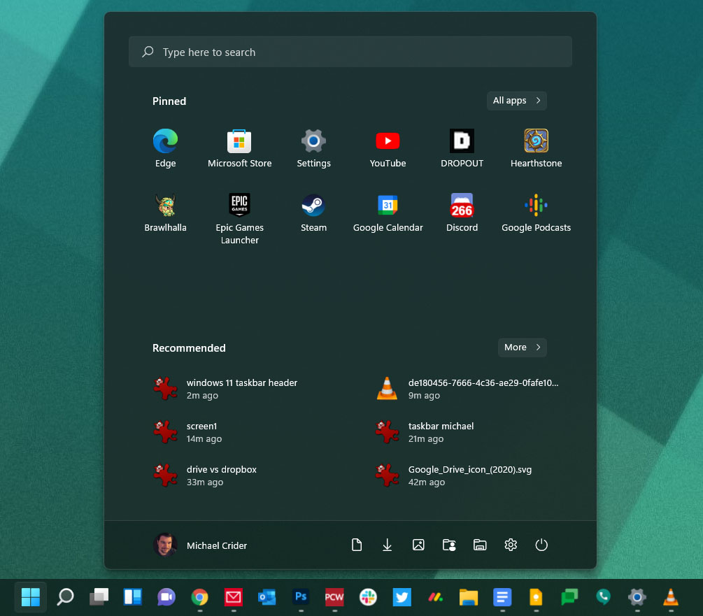
The biggest change to the new taskbar is that its tools and shortcuts are centered, as seen on the MacOS dock and (perhaps a better comparison) the ChromeOS taskbar. Microsoft is still intent on adding extra tools next to the Start button that I personally have never seen anyone use. But the more distressing change is that it’s no longer possible to actually see the title text of window items.

Use more than a few shortcuts and open apps, and the taskbar quickly becomes a row of difficult-to-spot shapes.
Michael Crider/IDG
This means that even if you have a dozen items open on your desktop—as I often do—you’ll be looking at a row of relatively tiny icons, with only a few pixels of indication that there are multiple windows of some items like your browser or Windows Explorer.
Microsoft clearly likes this scrunched-up interface; it’s been the default look since Windows 7 in 2009. And it makes a bit of sense: The design is merely combining the window management aspect of the taskbar and the Quick Launch toolbar first introduced in Windows XP. With users more and more used to a combined launcher and window manager, integrating these tools is a smart way forward. Moving them to the center of the screen is a pointless, but harmless, bit of cosmetics.
What isn’t smart is taking away the ability to see which items are which via text at a glance. In Windows 7, 8, and 10, Microsoft preserved the ability to label launched programs, hidden in the taskbar’s settings menu, but still easy enough to find for just about anyone. In Windows 11, it’s gone: Microsoft is finally forcing you to use those big, lonely icons sans text labels, just like the competition.
If I may be permitted a cliche: This is a perfect example of form over function. While I’m admittedly something of a whiny power user, I don’t see any reason why this option shouldn’t be preserved, especially since so very much of Windows 11 is just a bit of interface polish over Windows 10.
What’s the point of this change?
As I write these words, I have open on my primary monitor: two Chrome windows, two Explorer windows, two word processor documents, dedicated web app windows for Google Keep, Google Voice, and my company’s project management system, Photoshop, Steam, a Windows settings menu, and the Hearthstone game I forgot to close last night. On my 34-inch ultrawide, there’s more than enough space for all that with labels intact, for quickly finding what I need. I know that because I’ve been using third-party tools to bring back a Windows 10-style taskbar (more on that later).

I’ve got over 10 applications open on my ultrawide monitor, yet the taskbar still has almost two feet of wasted space!
Michael Crider/IDG
But I shouldn’t have to hunt for glitchy alternatives to bring back functionality that’s been a part of Windows since before I was old enough to hold a mouse. Maybe Microsoft would prefer everyone to use a less effective means of window management, maybe they want everyone to switch to virtual desktops. But that’s not going to happen, and cutting off this basic, simple functionality for apparently aesthetic reasons is as anti-user a decision as any I’ve seen from Apple.
On the plus side, Microsoft doesn’t seem to have a problem admitting its mistakes. After similar user backlash from the fullscreen interface in Windows 8, the company addressed the issue by bringing back a version of the Start Menu in 8.1, then transitioning to a more refined (and restrained) interface in 10. I predict a similar move here: Within a year or two, Microsoft will offer a more conventional taskbar experience, hopefully returning the option to place it at the top or side of the screen at the same time.
How to get the ‘real’ taskbar back
In the meantime, you have options. Having lived with Windows 11 for a week or so now, I think the best one is just to stay on Windows 10. At the moment you’re not missing anything, though that might change when Android app functionality gets a wider rollout.
But if you’ve bought a new PC pre-loaded with Windows 11, or you just can’t resist trying out the latest and (arguably) greatest, you have a few options. If you’d like to get the old non-combined, labeled items, there’s a patch for Windows Explorer, but you might have to re-install new versions of it as Windows 11 is updated.

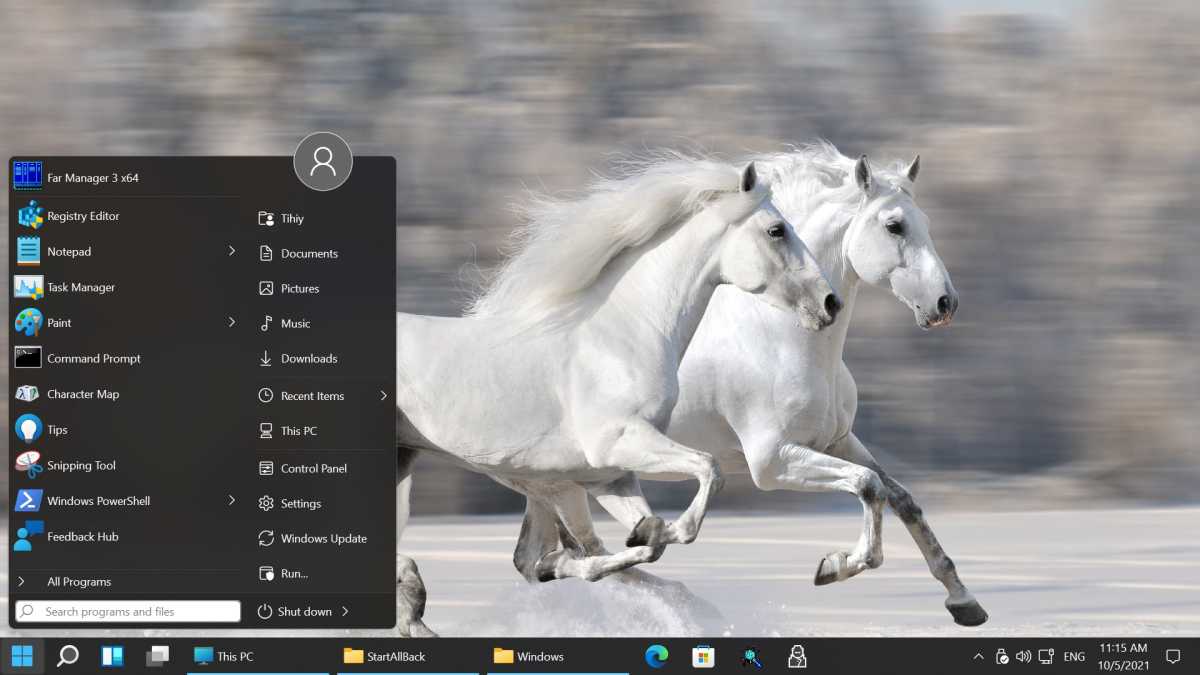
StartAllBack
A more elegant solution is StartAllBack, which allows more old-fashioned Start menu and taskbar functionality, StartAllBack will give it to you. It’s free to try for a month, and just $5 for a single PC license. Stardock’s Start11 offers similar functionality for the same price; it’s another excellent option.
Note: When you purchase something after clicking links in our articles, we may earn a small commission. Read our affiliate link policy for more details.
Michael is a former graphic designer who’s been building and tweaking desktop computers for longer than he cares to admit. His interests include folk music, football, science fiction, and salsa verde, in no particular order.

