Something looks familiar here.

Michael Simon/IDG
Today’s Best Tech Deals
Picked by PCWorld’s Editors
Top Deals On Great Products
Picked by Techconnect’s Editors
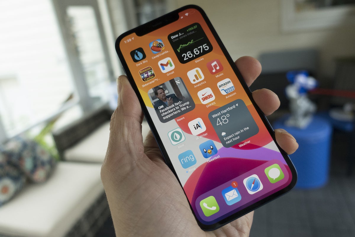
In just a few weeks, we should get our first sneak peek at the next version of Android when the developer preview builds start rolling out. But we may have just gotten our first taste of what Android 12 is going to bring, and if you like iOS 14, you’re going to love it.
XDA Developers has gotten its hands on “an alleged early draft of a document that Google made to summarize changes in Android 12,” and there are some obvious UI changes. You’ll immediately see more rounded corners for notifications, a simpler Quick Settings pane, and clear indicators when apps are using the camera or microphone.
There isn’t a ton to go on yet, but as you can see in the images, Android 12 is taking a few UI cues from iOS 14. It still looks and feels like Android, of course, but it appears Google was inspired by Apple’s newest OS.
 XDA-Developers/IDG
Android 12 vs iOS 14
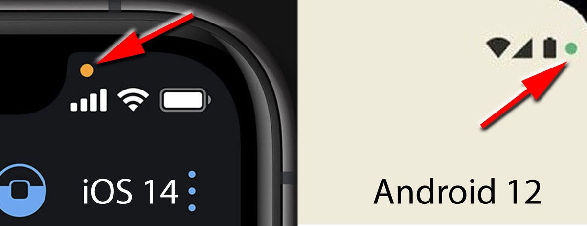
According to the leaked images, Android will now present a small dot to notify users that the microphone or camera is active when using an app, similar to how Apple handles it.
 XDA-Developers/IDG
Android 12 vs iOS 14
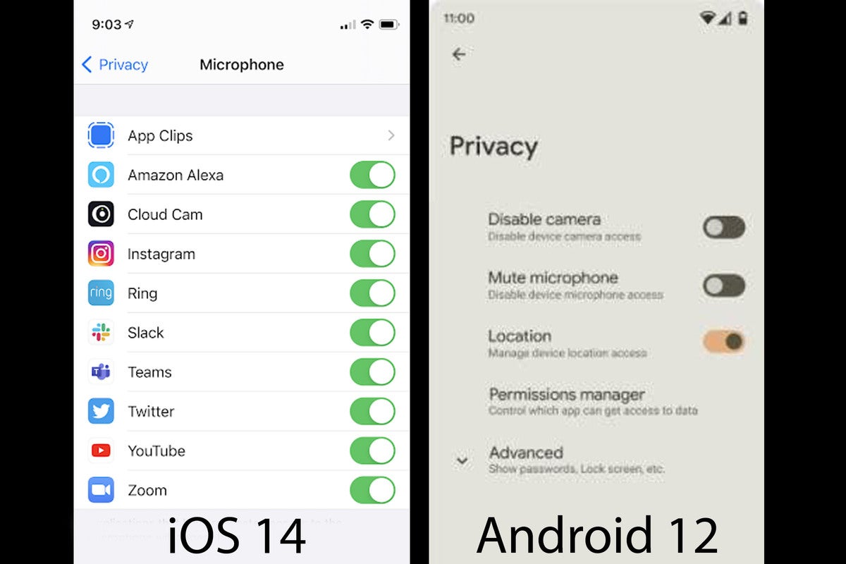
There will apparently be a new set of toggles in Android 12’s Privacy settings to quickly disable the microphone or camera completely. iOS doesn’t have that exact switch but the toggles for individual apps are quite similar.
 XDA-Developers/IDG
Android 12 vs iOS 14
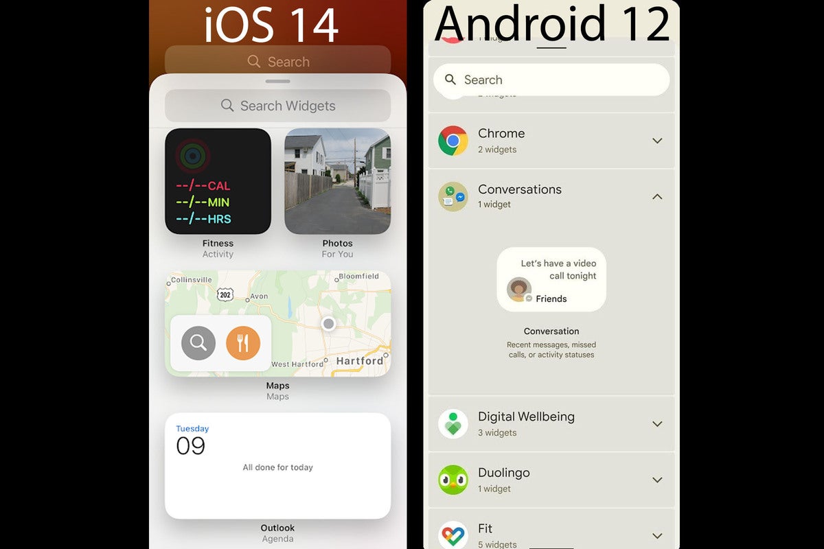
It appears as though Google is developing a new widget system in Android 12 not unlike the overhaul Apple pushed out in iOS 14. Along with a similar rounded shape, Android 12 looks to be unifying widgets in a way that makes things cleaner and easier on the eyes, along with smarter organization and a friendlier interface.
Finally,
 XDA-Developers/IDG
Android 12 vs iOS 14
Android 12 will reportedly tweak the Quick Settings pane, with square icons instead of circles and fewer options in a row.
Of course, it’s possible that none of these changes make their way into the final release of Android 12, but it’s hard to unsee the direction that Google is headed. Let’s just hope we don’t start seeing notches again.
Note: When you purchase something after clicking links in our articles, we may earn a small commission. Read our affiliate link policy for more details.
Michael Simon covers all things mobile for PCWorld and Macworld. You can usually find him with his nose buried in a screen. The best way to yell at him is on Twitter.

